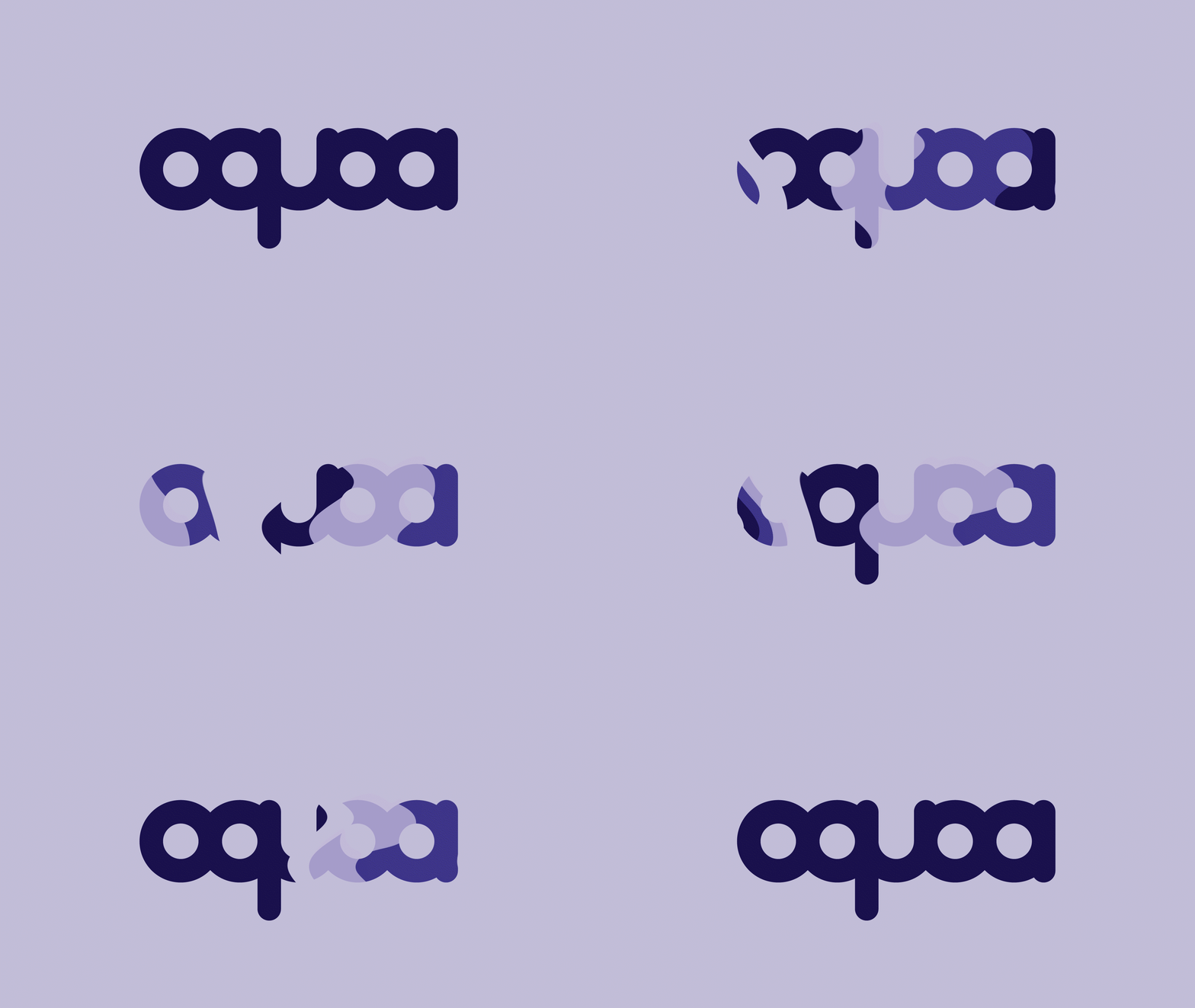
o-KO-uh
design, illustration and animation for oquoa’s january show with hussies at the sydney and their self-titled EP. hailing from omaha, ne, oquoa is a dream space rock pop band whose name is pure gibberish. so, like the origin of the name, the logotype had to match. the logo was built to be flexible and fluid. inspiration came from other bands and their logotypes, including weezer, metallica and the all-american rejects. the goal was to make ‘oquoa’ memorable, recognizable, and symmetrical. with that, the logotype has no modulation in stroke and rounded ends.


